Google uses mobile-first indexing for all websites — meaning it crawls,
evaluates, and ranks your site based on your mobile version, not your desktop
version. Mobile usability errors in Google Search Console are therefore direct
ranking signals, not just user experience warnings.
This guide covers every mobile usability error that GSC reports, explains what
causes each one, and gives you the exact steps to fix it.
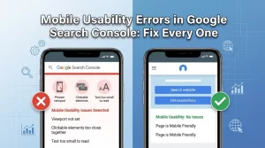
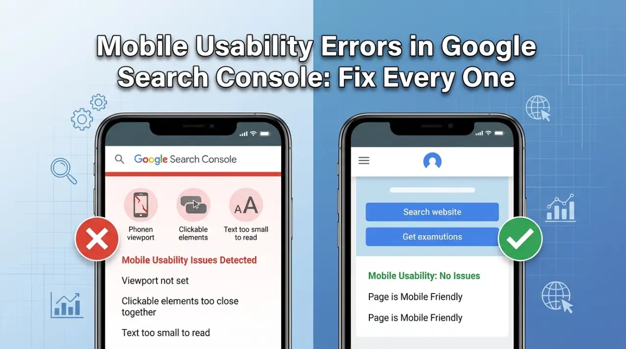
Where to Find Mobile Usability Errors in GSC
Go to Google Search Console → Experience → Mobile Usability.
The report shows:
- Total pages with usability issues
- Specific error types affecting your site
- Which URLs are affected by each error
Click any error type to see the list of affected URLs. Use the URL Inspection
tool to test individual pages after making fixes.
Note: In 2024, Google retired the standalone Mobile Usability report for some
properties and rolled these signals into Core Web Vitals and the overall Page
Experience assessment. If you do not see the Mobile Usability report in your
GSC, read our guide on the
retirement of Google’s Mobile Usability Report.
Mobile Usability Error 1: Viewport Not Set
What it means
The viewport meta tag tells browsers how to scale and display your page on
different screen sizes. Without it, mobile browsers display your page at full
desktop width (typically 960–1200px) and then scale it down — making text tiny
and layouts broken.
This error appears when Google detects that your pages have no viewport meta
tag.
How to fix it
Add this meta tag inside the <head> section of every page:
<meta name="viewport" content="width=device-width, initial-scale=1">
For WordPress: This tag is typically included in your theme’s
header.php file or in the <head> section your theme generates. Check by
viewing your page source (right-click → View Page Source → search for
“viewport”).
If the tag is missing:
-
Go to your WordPress theme editor (Appearance → Theme Editor → header.php)
and add the tag inside <head>
-
Or use a plugin like Insert Headers and Footers to add it without editing
theme files
For Shopify: The viewport tag is controlled by your theme’s
theme.liquid file. In Shopify admin → Online Store → Themes → Edit Code →
layout/theme.liquid. Search for “viewport” — if it is missing, add it inside
<head>.
For custom HTML sites: Add the tag to the <head>
section of every HTML file on your site.
Mobile Usability Error 2: Clickable Elements Too Close Together
What it means
Google’s guidelines require that interactive elements — buttons, links,
navigation items, form fields — have enough space around them that a user with
a typical finger size can tap the intended element without accidentally
hitting an adjacent one.
Google recommends a minimum tap target size of 48×48 CSS pixels with at least
8px of spacing between adjacent targets.
This is one of the most common mobile usability errors, particularly on sites
with:
- Tight navigation menus
- Dense blog post link lists
- Footer links packed closely together
- Mobile product filter sidebars
- Pagination buttons
How to fix it
Identify which elements are too close:
-
Open your page on a mobile device (or use Chrome DevTools’ mobile emulation
— press F12 → click the device icon)
- Navigate to the reported URL
-
Look for clusters of links or buttons that are small or tightly grouped
Fix using CSS — increase padding on links and buttons:
/* Too small — link has no padding */

a { font-size: 14px; }

/* Fixed — link has enough tap area */

a {

  font-size: 14px;

  padding: 12px 16px;

  display: inline-block;

  min-height: 48px;

  min-width: 48px;

}
For navigation menus: Increase the padding on nav links so
each item has at least 48px height:
nav a {

  padding: 14px 16px;

  display: block;

}
For footer links: Add more vertical margin between footer
link items:
footer li {

  margin-bottom: 12px;

}
For WordPress: If you are using a theme with a visual
customiser, look for “mobile menu” or “footer” spacing settings. If no visual
settings exist, add the CSS above to Appearance → Customize → Additional CSS.
For Shopify: Add custom CSS in Online Store → Themes → Edit
Code → assets/base.css or through the theme customiser.
Mobile Usability Error 3: Text Too Small to Read
What it means
Google flags pages where the primary body text is too small for comfortable
reading on mobile without zooming in. The minimum recommended font size for
body text is 16px. Text smaller than this is flagged as a usability issue.
This is common on sites that were designed for desktop first and not properly
adapted for mobile.
How to fix it
Check your current text size:
- Open the page in Chrome DevTools mobile view
- Right-click on body text → Inspect
-
In the Styles panel, look at the computed font-size value for body text
Fix using CSS:
body {

  font-size: 16px; /* Minimum for readability */

  line-height: 1.6; /* Comfortable reading */

}

p, li, td {

  font-size: 16px;

}
For WordPress using Gutenberg or page builders: Most modern
WordPress themes allow you to set the base font size in Appearance → Customize
→ Typography or directly in your page builder’s global settings. Set base body
font size to 16px minimum.
Watch out for: Relative font sizes. If your base body size is
14px and you use em or rem units throughout, all relative sizes will be
proportionally small. Fix the base size first, then check that relative sizes
still look correct.
Mobile-specific override: If you want different sizes on
desktop vs mobile, use a media query:
/* Desktop */

body { font-size: 18px; }

/* Mobile */

@media (max-width: 768px) {

  body { font-size: 16px; }

}
Mobile Usability Error 4: Content Wider Than Screen
What it means
This error occurs when horizontal scrolling is required to see all the content
on a page — meaning some content extends beyond the visible viewport width.
This is disorienting for users and breaks the mobile experience.
Common causes:
- An image wider than the viewport with no max-width constraint
- A table with fixed widths (e.g. width=”800px”)
- A pre-formatted code block with a long line
- An element with a fixed pixel width wider than the device screen
- CSS using absolute positioning that places elements off-screen
How to diagnose
In Chrome DevTools mobile view, if you can scroll horizontally, content is
wider than the screen. Open DevTools → toggle device toolbar → scroll left and
right to identify which element causes overflow.
Or in the terminal/DevTools console, run:
document.querySelectorAll('*').forEach(el => {

  if (el.offsetWidth > document.documentElement.offsetWidth) {

    console.log(el, el.offsetWidth);

  }

});
This lists every element wider than the viewport.
How to fix it
For images:
img {

  max-width: 100%;

  height: auto;

}
This single CSS rule fixes most image overflow issues.
For tables: Wrap tables in a scrollable container:
<div style="overflow-x: auto;">

 <table>...</table>

</div>
For code blocks: Add horizontal scrolling to pre elements:
pre {

  overflow-x: auto;

  white-space: pre-wrap; /* Or 'pre' with overflow-x: auto */
}
For fixed-width elements: Replace any width: [pixel value]px
on structural elements with max-width: 100% or percentage widths.
For WordPress: In the Additional CSS section of the
customiser, add:
* { max-width: 100%; box-sizing: border-box; }

img, video, iframe { max-width: 100%; }
Mobile Usability Error 5: Uses Incompatible Plugins (Flash)
What it means
Google flags pages that use Adobe Flash or other browser plugins that are not
supported on mobile devices. Flash has been officially dead since December
2020 — no modern browser or mobile device supports it.
This error is increasingly rare in 2026 but can still appear on older sites
that have not been updated.
How to fix it
Find the Flash content: Search your page source for .swf file
references or <object> and <embed> tags.
Replace it with:
- HTML5 video (<video> tag) for video content
- CSS animations for animated content previously done in Flash
- SVG for interactive graphics
- Canvas for Flash-based games or interactive tools
If you are seeing this error on a modern WordPress or Shopify site and cannot
find Flash content, check for very old embedded content from external sites
(old YouTube embed formats, old presentation embeds) and replace them with
current HTML5 equivalents.
After Fixing: How to Submit for Re-validation
Once you have fixed mobile usability errors:
-
Test the fix: Use GSC’s URL Inspection tool → “Test Live
URL” to verify the page is now mobile-friendly. Or use Google’s
Mobile-Friendly Test.
-
Request validation in GSC: Go to Mobile Usability report →
click the error type → “Validate Fix”. Google will re-crawl the affected
URLs (usually within 1–2 weeks).
-
Monitor the report: After validation, check back in 2–3
weeks to confirm the error count has decreased.
Mobile Usability and Core Web Vitals: The Connection
Mobile usability errors are separate from Core Web Vitals, but they are
related. Google uses both as part of its Page Experience signals. Fixing
mobile usability errors without addressing Core Web Vitals (LCP, CLS, INP) is
only half the job.
After resolving mobile usability errors, check your Core Web Vitals report for
mobile — LCP, CLS, and INP scores on mobile are almost always worse than
desktop, and these directly impact rankings. See our
Core Web Vitals guide
for next steps.
Summary: Mobile Usability Fix Priority
| Error | Difficulty | Impact | Fix Time |
| Viewport not set | Easy | Critical | 5 minutes |
| Text too small | Easy | High | 15 minutes |
| Content wider than screen | Medium | High | 30–60 minutes |
| Clickable elements too close | Medium | High | 1–2 hours |
| Incompatible plugins (Flash) | Hard | Medium | 2–4 hours |
Need Help With Mobile Usability Fixes?
If you are unsure how to edit theme files, or if fixing one mobile issue
creates new problems elsewhere, our team can audit and fix all mobile
usability errors as part of a complete technical SEO service.
Get a free technical SEO audit quote
or speak to our
web development team for hands-on
implementation.
Related reading: